ShaderSetupvideo2

Shader Setup Video 2

This is a one hour video in which I go over a fully finished model and set it up with my shaders.

The model and textures were provided by Boyluya. This is what the final result after the video looked like:

Hit the play button to see how I set this all up!

PostshadersFAQ

Post Shader FAQ

This page is dedicated to answering some common questions regarding my Post Shaders. Try to email me only if your question is not answered here.

HELP, how do i use this ?!

Getting Post Shaders to work for the first time in 3DS Max can be a bit tricky, most people don’t even know they are supported. Follow these steps:

  • Go to the utilities Panel and press the Configure Button Sets button.

  • In the Configure Button Sets window, scroll down until you find the “Scene Effect Loader”. Drag it onto on of the buttons on the right. I replaced some useless button I never touch.

  • After closing the Button Sets window, press the new Scene Effect Loader button to open the interface. Use the Load Effect button to load the effect files you want to use. The order in which you load them does not matter. Check “Scene Effects” to enable or disable all effects.

It doesn’t work!

There are several possible reasons for the Scene Effect loader not to work.

  • Double check if you followed the previous steps correctly.
  • Make sure you meet all requirements. An ATi X700 graphics card might not work properly. If you have a recent GeForce card (8 series and higher), you should be safe.
  • Don’t set your Max to any other viewport mode than DirectX9. DirectX10 is not better, do not use it. It actually has a lot more compatibility issues.
  • In Max 2010 and 2011, you might have to change the viewports’ Transparency settings. “None” tends to work better, strangely.
  • In Max 2010 and 2011, Post-Shaders don’t play nice with viewport Ambient Occlusion (SSAO). You’ll see only the AO, or weird splotches or other artifacts. I can’t help this, so turn off AO, or see if the transparency setting has any effect.
  • If the shaders seem to behave strangely in Max 2010 64bit, there might be a problem due to the Max 2011 trial. If you have installed the trial, your shaders might stop working in 64bit Max 2010. Autodesk might fix this. In the meatime, use 32bit Max.

How do I use the viewport grab script? It does nothing when i run it!

It’s a macroscript. that means you run it once and it defines an action that you can bind to a hotkey or custom button. Go to Customize > Customize User Interface. In the “Tools” Category you can find the entry created by the script, it is called “Grab Viewport”, without the ellipsis (… three dots) behind it. I recommend adding it to a custom toolbar to which you can add buttons for other usefull scripts.

My Anti-Aliasing stops working when I turn on the Scene Effects!

That’s normal. With DirectX9 and current realtime rendering, it’s not possible to have AA on a rendertarget, which is what Post Shaders rely heavily on.

But this isn’t really a problem, just use the HiRes GrabViewport script and capture at extreme resolutions. If you scale these down, you get perfect AA.

Why don’t you make Depth of Field (DOF) ?

That’s technically not possible. I have not figured out a way to access the Z-depth buffer in 3DS Max yet, which is needed for DOF. By default, applications don’t allow access to the Z-buffer while rendering. You could work around this by creating custom rendering code that creates your own Z-Buffer rendertarget, but this is not possible in 3DS Max.

There are a lot more limitations in Max than there are in games, but if you have an idea for a post shader, i don’t mind hearing it. Just try thinking if it would be possible to do in Photoshop on an image without any custom brushing. If it is, chance is it might work as a shader.

Postshaders

Postshaders

General

Download:

Compatible with:

  • 3DS Max 2008, 2009, 2010 and 2011.
  • ATi x1000 and up / GeForce 6 and up.

Links:

Go To Object Shader Page

Shader features

The goal of these shaders is to save you the trouble of going into Photoshop and post-processing your images. You can now do all the exact same operations in realtime, with immediate visual results. It’s faster and easier than using photoshop!

Listed below are all the separate Post Shaders included in the package, along with an explanation of what they do, how they can be useful and what parameters you can tweak.

Unsharp Mask

Sharpening

Post_Unsharpmask is a shader that fully mimics Photoshop’s Unsharp Mask filter. Realtime screengrabs can end up blurrier than their rendered counterparts. This shader allows control over the sharpen width with Blur Size and lets you control the effect strength with the Unsharp Strength spinner.

This effect should almost always be usefull to bring out details a little bit more. Works better when used in combination with the HiRes Grabviewport script (due to improved AA).

Color Correction

Channel Boosting

Post_Colorcorrect is the most versatile and useful effect of the collection. One of its’ features is the option to increase the contrast on each of the RGB channels separately using Red, Green or Blue Channel Power.

The default values are a 1,3 contrast boost of the Red and Green channel. This simulates a “Lomography” effect that increases contrast and shifts the colors towards a slightly warmer tint.

Color Overlay

Another feature is the ability to blend a specific color over the final image. This mimics the effect in Photoshop of blending a layer with a solid color over your image with the “Overlay” blend mode. The exact same math as in Adobe Photoshop is used.

By default the Color Blend is set to dark green. Dark blue would also work well as a value. Control the strength of the effect with Blend Strength.

The example on the left is similar to the color grading done in Resident Evil 5.

Gradient Overlay

Instead of blending a solid color, post_colorcorrect also allows for overlaying a gradient between two solid colors.

Select colors with Gradient Top and Bottom Color. Control the total effect with Gradient Strength. Shift the Gradients’ center position with Gradient Shift.

The default values are set to a gradient between cool blue and warm orange. This effect is similar to the post-processing sometimes seen in CSI Miami.

Do not use this together with Color Blend!

Vignet

The last feature of post_colorcorrect is the option to add a vignet to the final image. This mimics the effect of a real life camera vignet.

Vignet Power controls how the transition between light and dark happens. Vignet Radius Offset shifts the effect out- or inwards. Vignet Strength controls the effect strength.

Try not to increase Vignet Power much, it tends to create banding effects on a dark background. The values in this effect require a bit of tweaking compared to others.

Bloom

Improved Bloom

The only (slightly) useable post effect that comes with 3DS Max is post_bloom. My version improves significantly upon this effect by calculating and blending the bloomed areas in a different way.

Brightness Offset and Contrast Factor control which areas to bloom. The default values should work in most cases. Bloom Strength controls the total effect. Bloom Saturation controls how much the bloom effect is desaturated before it is added to the image. Decrease it for more color.

Blur Width controls how big the blur of the bloom effect is. Try not to push this too far, or you’ll get artifacts.

Achromatism

Chromatic Abberration

A minor effect, post_Achromatism, also known as Chromatic Abberration, simulates the effect a bad lense has on the Red and Blue channel. Both channels are offset slightly to opposing sides.

Control the amount of channel offset with Focus Shift.

This effect doesn’t play nice with Unsharp Mask, since it actually degrades the image by blurring it slightly.

Viewportshader

Viewportshader

This is a webpage dedicated to my realtime viewportshader for 3DS Max & Maya.

General

Download:

Compatible with:

  • 3DS Max 2008, 2009, 2010 and 2011.
  • Maya 2008 and up.
  • ATi x1000 and up / GeForce 6 and up.

Links:

Go To Post Shaders Page

Shader features

The following list goes over the main shader features and settings, in order of their appearance. Settings are explained and some tips are given regarding their usage. An animated GIF is provided to illustrate the effect. Italic words signify that the name of an actual setting in the shader is mentioned.

Read this if you are trying out the shader for the first time!

Lighting

3 Light support

The shader can toggle between the use of up to 3 Omni Lights using the Active Lights spinner. Using light types other than Omni can be unpredictable and is not supported.

Each light is selected using the respective Light # Position dropdown list.

Light settings such as color and intensity are taken from the light in Max and can’t be adjusted in the shader.

Realtime Shadows

Realtime Shadows from Max 2008 and onwards are supported in the shader. In Max 2010 and onwards, only Hard Shadows are supported yet, Soft Shadows will not work. Read the FAQ on how to enable these.

Select the light to cast shadows with shadowTerm1. The specular for Light 1 will be masked by the shadows, so try to only use Light 1 for shadows.

The shadows can be blurred with the Shadow 1 Blur spinner.

These options are not available in the Maya version of the shader.

Half Lambert Shading

Users have the option to enable Half Lambert-type shading, as seen in Valve’s Team Fortress 2. This type of lighting calculation allows the user more control over the blend between light and dark, allowing for more illustrative rendering.

Works great with smooth, solid surfaces and brighter colors. Don’t expect this to do much on a realistic, grey/brown scifi prop with heavy normalmapping.

Control the smoothness with the Half Lambert Power spinner.

Take note that shadows don’t behave entirely predictable with this shading mode.

Shaded Hue Adjustment

A special feature, unique to this shader, is the adjustment of Hue in more shaded areas. What this means is that Hue, Saturation and Brightness are slightly tweaked in areas that receive less light, making for more vibrant, illustrative colors.

It is highly recommended to use this in combination with Half Lambert and an ambient color other than black, the effect will not be as visible without.

The Shaded Hue Adjustment spinner controls how much of the effect to apply. turn it off by setting this to 0.

Ambient IBL

Apart from standard, solid color ambient lighting, the shader also supports Image Based Lighting for ambient conditions. Using a cubemap that is heavily blurred by the shader, more interesting, colorful ambient conditions can be achieved. Recommended for increased realism!

The Ambient Cube Blur spinner controls how much the source cubemap needs to be blurred. There is no sure value here; it depends on the resolution of the cubemap. My cubemaps need a value between 7.0 and 8.0.

With Ambient Cube Strength you control how strong the ambient light is.

Share Reflection Cubemap for IBL allows the use of one cubemap for both reflections as ambient. The IBL Cubemap slot is ignored in favor of the Reflection Cubemap slot.

Baked Lightmap

Static, baked lighting is supported by the shader. The lightmap texture can use a different map channel than all other maps, allowing for multiple UV sets to be used.

With the Lightmap Multiplier you control how strong the effect of the lightmap is applied.

You can use baked lighting together with 3 dynamic lights. This isn’t really a viable option since there is no light attenuation/decay. For that reason, it’s best to set the Active Lights spinner to 0 when using a lightmap.

Maps

Diffuse Map

Standard Difusemap is supported by the shader, with the addition that a diffusemap can be multiplied with a solid color by ticking Color Diffuse map.

This is useful for changing the entire tint of a model with just AO or lighting baked into the texture. The example to the left shows that a grayscale car body texture  can be changed to any color tint using this option.

Opacity Map

Opacitymaps are supported as the alpha channel of the diffuse texture. That means you will have to use a format such as .TGA to get this to work. Tick Enable Alpha Channel to use the opacitymap.

With Global Opacity you have control over the overal opacityof your material. Useful if you want to create a glass material but don’t want to create an opacitymap (yet).

In Max 2010 onward, you might have to change the viewports’ Transparency quality to get decent results.

Specular map

Colored or greyscale specularmaps are fully supported by the shader. If no specularmap is used, a solid Specular Color can be defined.

Specular Global Level defines the total specular strength and can be usefull to change the look of your specular highlights without having to adjust the texture.

Gloss Map

A Glossiness map is supported to control the sharpness of specular highlights. This map should be in grayscale format.

Using Glossiness Level (which doubles as global gloss control if no map is used) and Gloss Offset, you have precise control over how the black to white range of the glossmap is used by the shader.

In the example, a noisy glossmap combined with a Level of 75 and Offset of 52, is used to fake metallic paint flakes.

Normal Map

Normalmaps are fully supported, both Tangent- and Object-Space normalmaps. Switch between them with the Object Space checkbox.

The map’s green channel can be flipped with Flip Green, Red and Green Channels can be switched with Switch RG Channels.

Self Illumination Map

For all SciFi glowy bit needs there is support for a Self Illumination or Glow map. With the SI Map Multiply spinner you can control the map’s global strength

Using the Global SI Level spinner you have control over the total self illumination. This can be used to disable all lighting and see your diffuse texture without any other effects. Good for judging how well your painted lighting or AO works.

Fresnel Functions

Outline

Outline is an experimental feature that adds an colored outline around your model, based on the viewing angle. It is not a refined feature and might be completely changed or omitted in the future.

Change the outline thickness using Edge Step. Change the outline color using Edge Color.

Can be used for a stylized effect as seen in Borderlands.

Fresnel Reflection Power

Fresnel Relfections are one of the most extensive features of the shader. It is a view-dependant effect that is used mainly to simulate reflections and can really help to bring out details in a model.

The Fresnel Power spinner controls how strong the fresnel effect will be at the edges of the model.

Fresnel Reflection Bias

Fresnel effects normaly only work on pixels that face away more from the camera. For realistic effects, you might want to have some slight reflection on those pixels facing towards the camera.

The Fresnel Bias is an offset value that allows you this sort of control. Works best for Hard-Type and Cubemap relfections, on materials such as metal or glossy paint.

Fresnel Reflection Multiplier

The Fresnel Multiplier spinner controls the total strength of the fresnel effect. It is simply a multiplier for the final fresnel value.

Use this if you want really faint reflections, or if you really want to boost your fresnel effect.

Take note, the default value is 2,0, this works great for Hard-Type and Rimlight reflections, but needs to be turned down to 1,0 if you use a Cubemap.

Fresnel Reflection Type

There are 3 types of Fresnel Reflections. Two of them are “procedural” and don’t require any external files; they are completely defined by code in the shader.

  • The first type is on by default, by having the Use Hard-Type World Masking checkbox ticked. It’s comparable with a simple studio-gradient environment and makes for crisp, defined reflections.
  • The second type can be toggled by turning off the Hard-Type checkbox. It’s not a true reflection, but rather a Rimlight effect that is masked depending on how much normals point towards the ground. Inspired by Valve’s rimlighting in Team Fortress 2, it is more suited for characters and illustrative rendering.
  • The third type of reflections depends upon a Cubemap texture file. If you check Reflect Cubemap and load a DDS cubemap in the Cubemap slot, the shader wil override the previous reflection types and use the cubemap only. For realism, this option is best.

Fresnel Mask Hardness

The exact top-to-bottom blend of both procedural reflection types, Hard-Type and Rimlight, can be controlled with the Fresnel Mask Hardness spinner. This spinner has no effect on cubemaps.

For Rimlight, a value of about 3,0 to 6,0 works best. For Hard-Type, a value between 2,0 and 20,0 works well.

Reflect Mask texture

Reflections might need to be masked, just like specular. By default, fresnel reflections are masked with the specular texture, but this can be overriden to use a specific texture that masks just reflection, allowing even more control.

For example, you might have a car tire and rim mapped to one texture. You want the rubber tire and metal rim to both have specular, but only the rim should have shiny reflections. In this case creating a custom Reflection Map is a better solution than creating a second shader material.

Cubemap Blurring

Cubemap type reflections can be blurred by the shader using the Cubemap Blur spinner. This is similar to a glossiness control on the specular highlights. Instead of just sharp, paintlike reflections, you can also achieve glossy, soft metal-like reflections with this setting. It can even serve as a complete replacement for specular.

The Cubemap Blur setting is limited to 10, but the value needed for your cubemap depends on the resolution of your cubemap. If you go too high, everything will be blurred out and the cubemap will not be visible anymore. For the cubemaps I provide, a value of 7,0 is the maximum, while 5 to 6 work nicely for glossy reflections.

You can even set the Glossiness map to control the Cubemap Blur, by checking Use Glossmap for blur.

Gallery

Click here to go to the viewport shader gallery to see some examples of the shader in action!

hotrod

HotRod

Portfolio piece, my own design, loosely based on Brütal Legend.

  • 19.500 tri’s
  • 4 texturesets (diffuse, normal, specular)
  • 2048px to 256 in size
  • realtime screengrabs only

The first image was featured in 3DCreative Magazine’s february 2010 issue.

“Making Of” series can be followed at CgTuts+

Images

FinalGrab001

FinalGrab002

FinalGrab004

FinalWire005

WIP009

Creating Ivy

A simple walkthrough on how you go about creating lowpoly Ivy meshes to decorate a scene with.

01

This is the bare wall we will be decorating with some ivy.

02

The hardest part in the entire process is actually coming up with good textures. You need a diffuse map, for color. Notice how a green background color was used, to prevent color bleed at the edges, very important. The opacity map is just simple black and white. Creating the opacitymap can be a lot of work, so consider tricks such as desaturating the images and playing with brightness contrast as well as inverting. Also, looking at the Red, Green or Blue channel and using that as a start for the opacity map can be a huge timesaver, especially the green channel since the plants will mostly be green. The textures I use here are from Unreal Tournament 3, and serve just to illustrate the point of this tutorial.

You can group a few separate bits of plant onto one file. It’s actually recommended to do this, since you’ll use less texturespace and have more variation to work with.

03

Once the textures are done, I create a material in Max with both texturemaps.

04

Then, I create a plane and assign this material to it. It’s important that the plane has a few subdivisions.

05

The first method to Uv this plane, is to just Use UV unwrap and align the mesh onto a matching part of the texture. Moving the points around actually stretches the texture, so this is not the best method.

06

Once UV’ed, I rotate the plane upwards and moves the vertices around a bit to give the mesh thickness.

07

Another method is to use a UVW Map modifier on your plane. Set it to square proportions. In the editable poly underneath, I turned on “Show End Result”. This means, I can change the shape, and will still see the correct Uv’s.

08

Here I moved the vertices around so they fit nicely around a piece of the texture. This method is a lot better, because you can change the mesh shape and UV’s at the same time, without stretching!

10

I repeated the same proces of moving points to add depth, and created a third ivy mesh. You can go all the way and create 20 different varaitions, but about 5 should be enough most of the time.

11

All I did then, was move and copy the meshes around. Sometimes I mirrorred them, sometimes they were scaled a little bit. They overlap and intersect a few times. You have to take care they don’t clip into the wall, as this can look fake.

12

The rendered result looks like this. Only 3 different meshes can look convincing already. It’s important to note that this was rendered with Ray Traced Shadows, the only type of shadows that will cast correct shadows (using the opacity map instead of geometry).

Importance of Reference

This is an article I’ve created together with Robert Dukes.

When creating 3D art, be it realistic or stylized, using reference is one of the most important parts of the process. It is as critical as modeling, unwrapping or texturing. Unfortunately, it’s an often overlooked aspect, especially by new or inexperienced artists. Since the creation of any art asset starts with building reference, you can go as far as saying that the final quality of the finished product is largely defined by the effort you put into reference in the beginning.

Just imagine you’re building a house. You wouldn’t start building without a plan or any sort of idea where you are going. The building process itself may be more fun than planning, but in the end the house will not fit together well, look bad, or just collapse if you worked without a plan. The same goes for 3D art. Your work can end up looking fake, unfinished or just a little wonky, but you can’t put your finger on why that is.

With this article, we aim to offer some insight in the process of using reference when creating 3D art.

Choosing

The reference process can be broken down in several key stages. The first stage being the obvious making a choice of subject. Even though this is not always possible, for example as an artist working in a studio, it is important when creating a portfolio piece to show off your skills at their best.

Enthusiasm

When choosing a subject freely, something that you want to recreate as awesome as you possibly can, there’s no doubt you need to be interested. Not being interested in what you create is almost certain to result in a sub-par result.
So don’t just choose “some random car” without caring for even its brand or model year, don’t just pick an AK47 as weapon because that’s what everybody does and it seems easy. Pick a subject that caught your attention and makes you imagine driving, shooting or using it ingame when you’re only just looking at a picture of it.

Gaining an Interest

To help make your choice easier, look up textual information about your subject. Finding out information on your chosen subject, learn about it. How it works, what it’s made of, what its used for, why it exists, who uses it, what different types there are, anything you can find out is good. This might help to spark your interest and motivate you, as, for example, you find out that there is only one type of this car in the world, that this weapon was a revolution when it was first created or that your subject played part in a critical stage of history.

Cala

The Lamborghini Cala is a unique prototype car. Only one was ever built before the entire project was cancelled. A difficult but rewarding subject.

Groza

The OTs-14 Groza is a bullpup variant of the popular AK74 assault rifle. Very interesting visually and not as common as the omnipresent AK.

Gathering

Gathering reference is the next step in the process, but you should actually already be gathering reference material when researching info on your subject. You could even be performing this step for a project you’re not even sure you will ever create; having a few folders of material on interesting subjects is great for when you’re looking for idea’s.

Sources

Your main source is of course Google image search. You can probably get around just searching here, but it can be interesting to search on another website as well. Searching by tag on flickr.com can provide some interesting results on certain subjects, especially environments, but you’d be surprised what else can turn up in people’s photostreams. When researching real life locations, google maps and google Streetview can be an amazing help. There are also websites dedicated to photos of specific subjects such as sport cars, military equipment or locations.

There’s more than just internet! Books, magazines and papers can provide great reference that you just won’t find on the net. Buying a model or replica of whatever you’re creating can be great since you’re holding things in your hands (just remember it needs to be accurate as well). You can take this further by actually going out for the real thing. Visit a car dealer and ask them if you can take pictures, an airsoft or real weapon store for (replica) weapons, visit a location similar to your subject, or even the real thing. Just remember to be polite and explain why you want to take pictures.

Modelkit

A model kit is great reference since you can look at any part from any direction.

FerrariShowroom

A sportscar showroom might seem like a posh place for a mere 3D modeler, but just asking in a friendly way could enable you to take fantastic reference pictures of your subject.

Organization

Often forgotten by many people: organize your materials! Organizing your images into folders can be annoying at first but will definitely pay off in the end. A good way to do this is by creating at least a “/Reference” folder in your project’s directory. Splitting this folder up into others can help once you start to have a lot of reference, for example “/Reference/exterior” or “/Reference/wheels”. If you have blueprints, create a special folder as well, since these are special images you want to find easily.

Just imagine trying to find that one image of an engine wire, in a folder full with hundreds of other images of car parts, body panels, interior shots, renders, rims, wheels… If only it was in the “engines/parts” folder!

folderstructure

Folder Structure that will help organize your images and help you find exactly what you are looking for when ever you need it.

Quality

A very important thing to pay attention to is the quality of your reference material. The higher resolution a picture, the more it will help you. Make it a rule for yourself not to use images below 1000 pixels wide as main reference, unless you absolutely cannot find an alternative. Google images’ search options are very helpful here. Also pay attention to aspects such as focus, lighting and camerangle, since even high resolution pictures can end up out of focus and underlit.

AstonGood

AstonBad

Variety

Ideally, you want every aspect covered by your reference. So try to gather good pictures of every single angle and detail. Even if you think you have everything, it’s still possible to run into a part that just isn’t clear on any of your reference pictures, forcing you to go look for more.
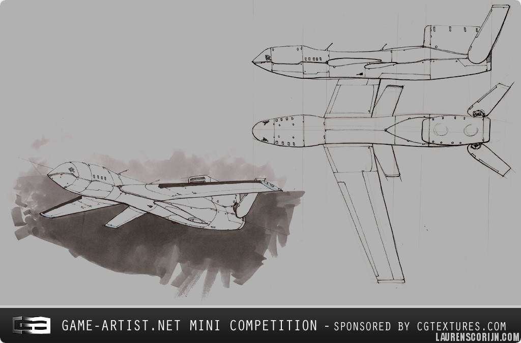
It can also be extremely helpful to look for technical diagrams, exploded views and detailed blueprints of your subject. Seeing what’s exactly beneath the surface is very helpful.
Remember: you can never have enough reference!

AstonVariety

Analyzing

Reference is not just mindlessly saving every high-res picture. It requires thinking and analysis to make the most out of it. This is very vital to make the most ut of your reference material.

Differences

When collecting reference, minor differences can become apparent. Some cars have a scoop on one picture and not on the other, a gun can have a slightly different grip text on one website while it does not on another. Try to find out why this is so you can decide what reference is more accurate, or which version you want to create. Mixing up two different versions of an object can come out pretty strange if you didn’t pay attention to this fact.

F355_engine

These two reference pictures of the Ferrari F355’s engine bay show that even for the same type of car, differences can occur. You should try to keep these in mind.

Generalizing

When creating something large and complex, factors such as workload are something an artist needs to think about. In such a case, it’s important to look for common elements that are key for resembling the reference. A city can have hundreds of different types of cars, but it’s smarter to decided to build a few that are very typical for that region. For an American city, you should choose to make the very typical, big American vehicles, for an Italian city smaller, Italian cars are better suited. This can be applied to any sort of large scale project, where smart choices need to be made to optimize workflow and still guarantee accuracy and recognizability.

NY01

A city scene in New York might seem daunting for the sheer number of different assets you see on your reference.

NYford

However, analyzing reference, one can see that the yellow Ford Crown Victoria taxi’s appear all over the place. What’s even better, is that with some small model changes and a retexture, you can create a typical NYPD cop car from the same model.

Re-interpreting

A special case of reference usage, is when you’re creating your own, fictional subject. This can be seen as the next step of generalizing; you’re mixing and matching reference to create something new. A big mistake many people make is using little or no reference when creating their own designs. Reference is just as, if not more important when creating something fictional. When creating something existing it’s easy to make accuracy mistakes when not paying careful attention, with a fictional subject things can go wrong even quicker.

Creating your own design should not be taken lightly. For beginning artists it’s best to stick to accurately recreating an existing subject. You maximize your chances of success and avoid common pitfalls. You practice modeling accurate, an important skill, and after a few projects you’ll start grasping what is it that makes a 3D object look good and correct. There’s just no point in loosely basing yourself on a real subject, without putting thought in the changes you’re making. The end result will most probably end up looking like something’s off (lifting the viewers’ suspension of disbelief), to just plain out weird and wrong.

NanosuitRef

When Crytek designed the fictional Crysis Nanosuit armor, they strongly relied on reference such as human muscles and future armor suits.

Using

When you finally have all your reference and put all the thought and care into it, you can start creating your object. Remember, the amount and quality of reference as well as the thought you put into it can largely determine your ultimate success. Make sure you don’t trip over the critical first steps!

Comparing

Pretty much all you’ll be doing, is comparing your current work with the reference you’ve collected. It’s safe to say you should never model without your reference folder and an image viewer open at the same time. This stage of 3D is one that is very thankful for a second monitor; your 3D application on the first monitor, image viewer with reference on the second monitor, to allow for constant synergy between the two.
For everything you’re not sure of when modeling: go back to your reference and compare. Even the thickness of a tube, the roundness of a corner or how strong a slope is, will require you to look at reference. If your reference proves insufficient: go out and find more. A great tip is to position the 3D model over a reference picture and try matching the camera FOV and rotation, to compare how different the model is from the reference. This allows one to see exactly if the model is out of scale or does not have the correct proportions.

Ref_WRX

As you can see this Subaru WRX does not look anything like its real world counterpart. Sure, it is resembles it and you can see that its a “WRX” however there is not much besides the base shape that makes this car on the left a WRX.

Conclusion

This article should show you how important reference is to a 3D artist when re-creating real life objects or even his own ideas. Trying to do things from the top of your head is not the ideal way to create 3D art because we forget, neglect and misinterpret things. Having reference, organized and plentiful, is a great way to ensure to ensure you create your 3d art exactly the way you wanted to from the beginning. Success starts at the beginning!

UAV

MQ-10 Cyclops UAV

A fictional UAV I made for the game-artist.net mini competition. It was loosely based on a concept provided by them, but I changed and improved a lot of design features, taking a lot of inspiration from the MQ-9 Reaper UAV.

The model stands at 1942 tri’s with a 1024 diffuse, normal and specular texture. Presentation was done in 3DS Max 2010 with my shader.

Images

001

002

003

004

005

006

007

UAVTextures_small

viewportshader

NOTICE:
Xoliulshader.com is down because JustHost have decided to triple my hosting costs. I will try to work out a solution soon.

Hold on until I provide a temporary downloadlink.

Projects

Test frontpage